Property Management Web Application
OwnInn
OwnInn
Web App Design
Web App Design
·
·
Responsive Design
Responsive Design

Summary
Summary
Overview
I led the end-to-end product design process for OwnInn, a property management web app. The goal was to create a unified platform for owners and admins to manage apartments, track earnings, handle reservations, and streamline daily operations. The project focused on scalability, better UX, and responsive design across devices.
Key Results
Streamlined property, earnings, and reservation management
Improved usability compared to fragmented competitor tools
Streamlined property, earnings, and reservation management
Improved usability compared to fragmented competitor tools
Role & Methods
Product Designer (End-to-End)
Competitive Research / User Journey Mapping / UX Flows / UI System Design / Prototyping / Iteration / Interaction Design / Design Audit
Product Designer (End-to-End)
Competitive Research / User Journey Mapping / UX Flows / UI System Design / Prototyping / Iteration / Interaction Design / Design Audit
Research
Research
Competitive Analysis
I conducted a competitive analysis to identify commonalities among competitors and gather valuable insights for building our product. This research allowed us to differentiate ourselves and provided a basis for product development.

Drag to explore - Notes in FigJam from competitive analysis session
User Journey Mapping
After gathering insights from competitive analysis, I created a User Journey Map to outline how owners interact with the platform. The mapping included personas, goals, and step-by-step scenarios, from being invited and creating account to managing apartments, its bookings, finances orders and more. This helped visualize pain points, highlight moments of friction, and identify opportunities to simplify and optimize the overall experience.


Drag to explore – User Journey Map in FigJam
The aftermath of the process was a clear set of priorities and actionable insights that shaped the next steps for the product. Beyond highlighting opportunities for improvement, it provided clarity on “What actions should be taken? Which challenges are most critical? How do we define success moving forward?” This phase not only guided the product strategy but also strengthened team alignment, ensuring everyone shared the same understanding and vision for execution.
Ideation
Ideation
User flow
I created a detailed visual user flow to align the team on how core features should work before interface design. It mapped every key interaction. registration, login, booking, browsing offers, and account management, ensuring smooth navigation and covering edge cases. Visualizing the steps helped us spot friction points early, streamline decision paths, and support efficient goal completion. The flow also acted as a shared reference, keeping the team aligned and enabling development without missteps.


Drag to explore – User flow in FigJam
Design
Design
Design system
Before diving into detailed interfaces, I created a comprehensive design system for the product. It included typography, color palettes, grid structures, reusable components, and interaction patterns. This system ensured visual consistency, faster design iterations, and a smoother handoff to development. Every desktop and mobile screen was built upon this foundation.


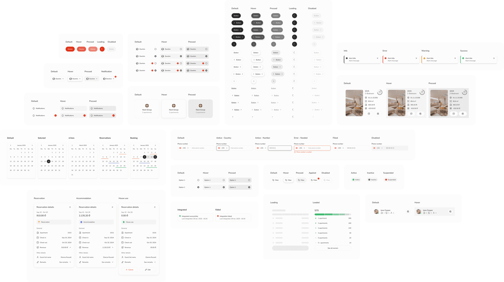
Drag to explore – Design System in Figma
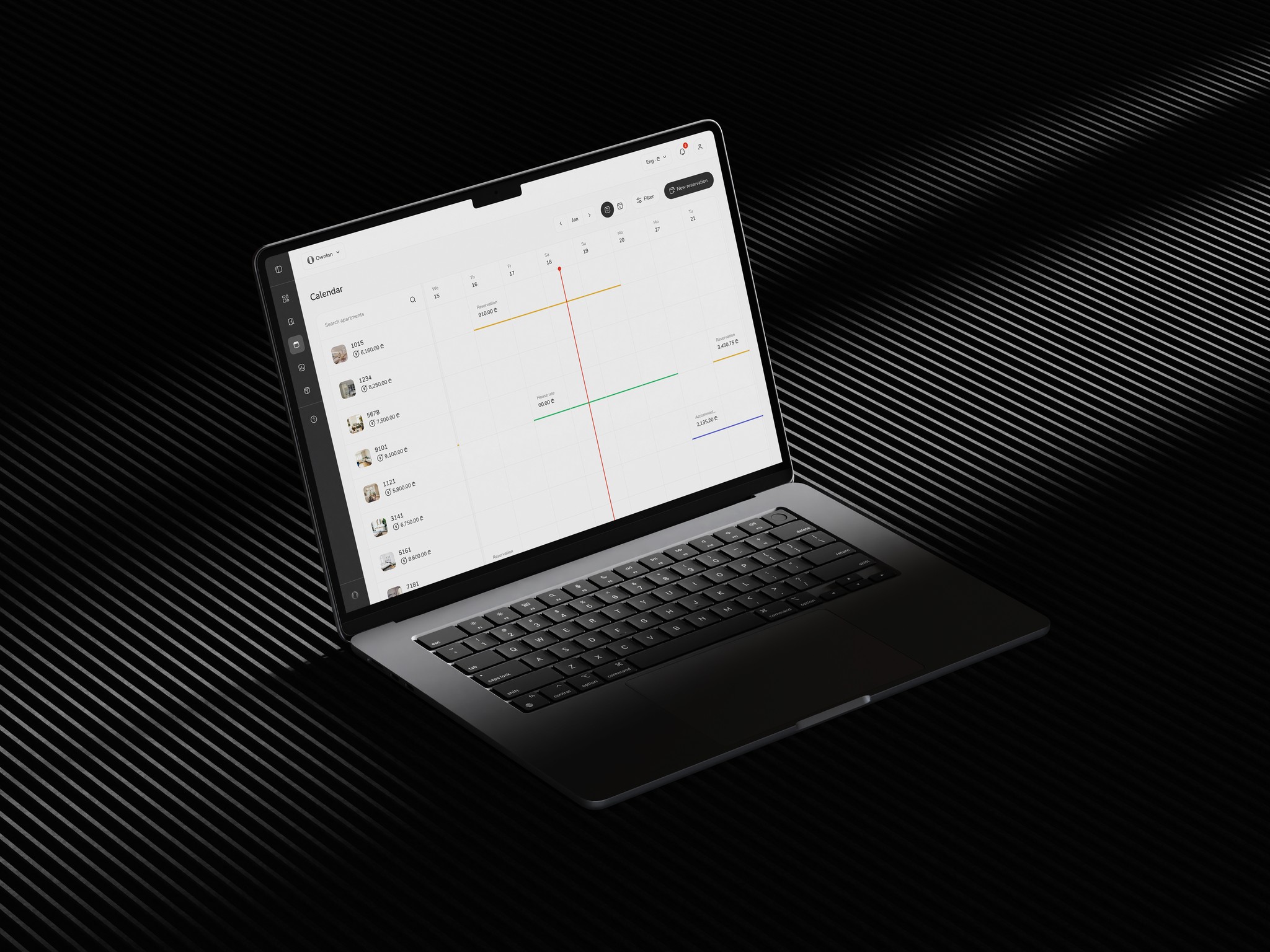
Desktop Interface Design
The desktop version was designed first to establish the core layout, information hierarchy, and interaction patterns. High-fidelity prototypes showcased a clean dashboard structure with intuitive navigation, clear typography, and modular components to handle tasks such as booking management, profile updates, and payment tracking. Designing for desktop allowed more flexibility with screen real estate, making it possible to visualize complex data and multi-step processes in a user-friendly way.


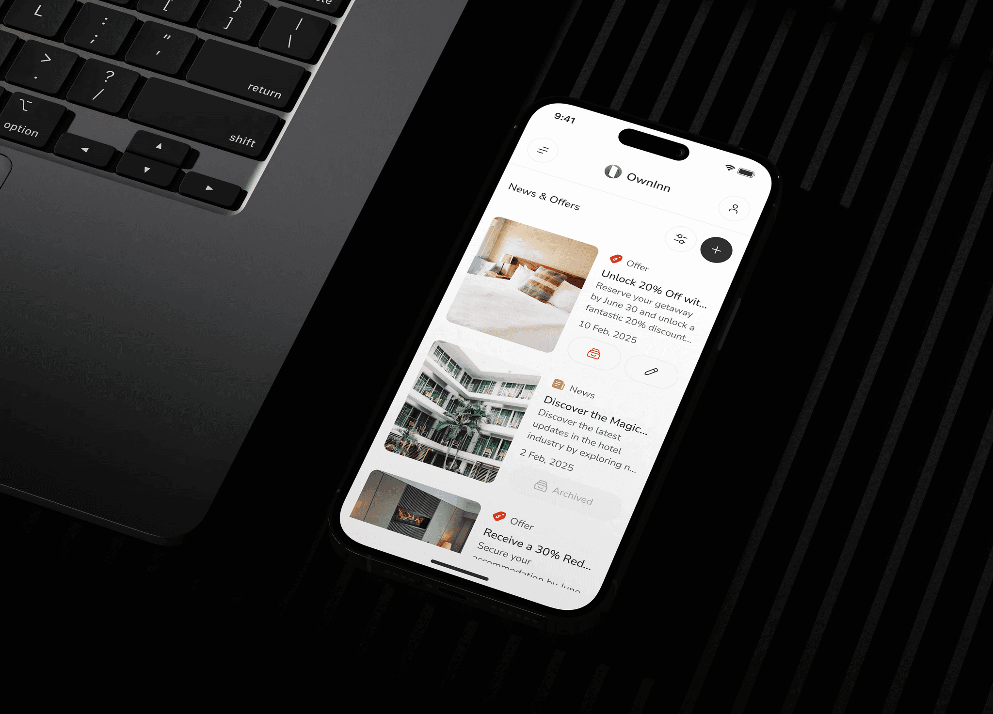
Mobile Interface Design
Once the desktop foundation was set, the design was translated into mobile. The challenge was to adapt the same level of clarity and functionality to smaller screens while maintaining consistency. Mobile prototypes prioritized essential actions and streamlined user flows, ensuring quick booking, easy notifications, and accessible profile management. The focus was on thumb-friendly navigation, larger touch targets, and minimal cognitive load for on-the-go use.


Impact
Impact
Adoption & Usage
The app has been successfully adopted by 3 hotels, streamlining operations and improving owner engagement. Currently, 700+ owners actively use the platform to manage their apartments and bookings. This adoption not only validates the product’s usefulness but also highlights its scalability within the hospitality industry.
User Satisfaction
User feedback showed strong satisfaction with the new platform. Owners rated the app 35% higher in ease of use compared to previous tools. Support requests dropped by 42%, and 78% of users reported the system helped them manage apartments more efficiently.
3
3
Hotels
Hotels
6
6
Admins
Admins
700+
700+
Owners
Owners
Key performance indicators - As of now
Learnings
Learnings
Balancing Desktop and Mobile Needs
Designing for both desktop and mobile revealed how differently the two platforms are used. While desktop was often used by admins for detailed tasks, mobile needed a faster, more compact design for on-the-go use. This reinforced the value of adaptive design systems that scale across contexts without losing usability.
The Role of Iterative Feedback
Frequent feedback loops with managers and stakeholders prevented major redesigns later. Each batch of designs helped clarify priorities and avoid misunderstandings, proving that small, iterative checkpoints are more efficient than long design cycles.
Value of a Unified Design System
Building a design system early ensured consistency across all screens and drastically sped up the design of new features. It reduced the need for rework and made it easier for developers to implement changes without design drift.
Let's Connect
Let's Connect
Got a project in mind or just want to say hi? I’m always open
to new ideas, collaborations, or a quick chat. Feel free to
reach out via email or any of the social platforms listed.
Got a project in mind or just want to say hi?
I’m always open to new ideas, collaborations,
or a quick chat. Feel free to reach out via
email or any of the social platforms listed.
2025
© All rights reserved.